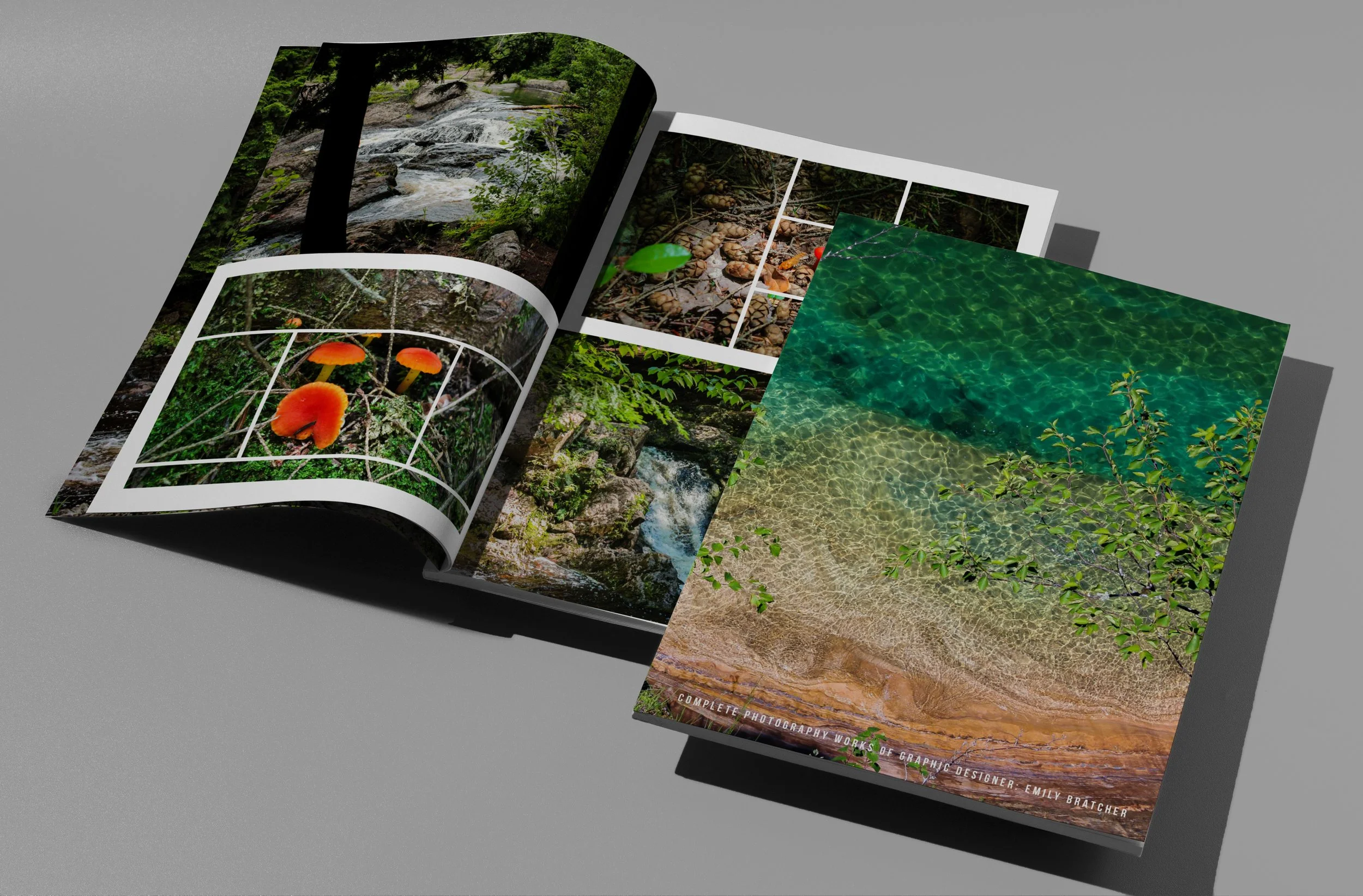
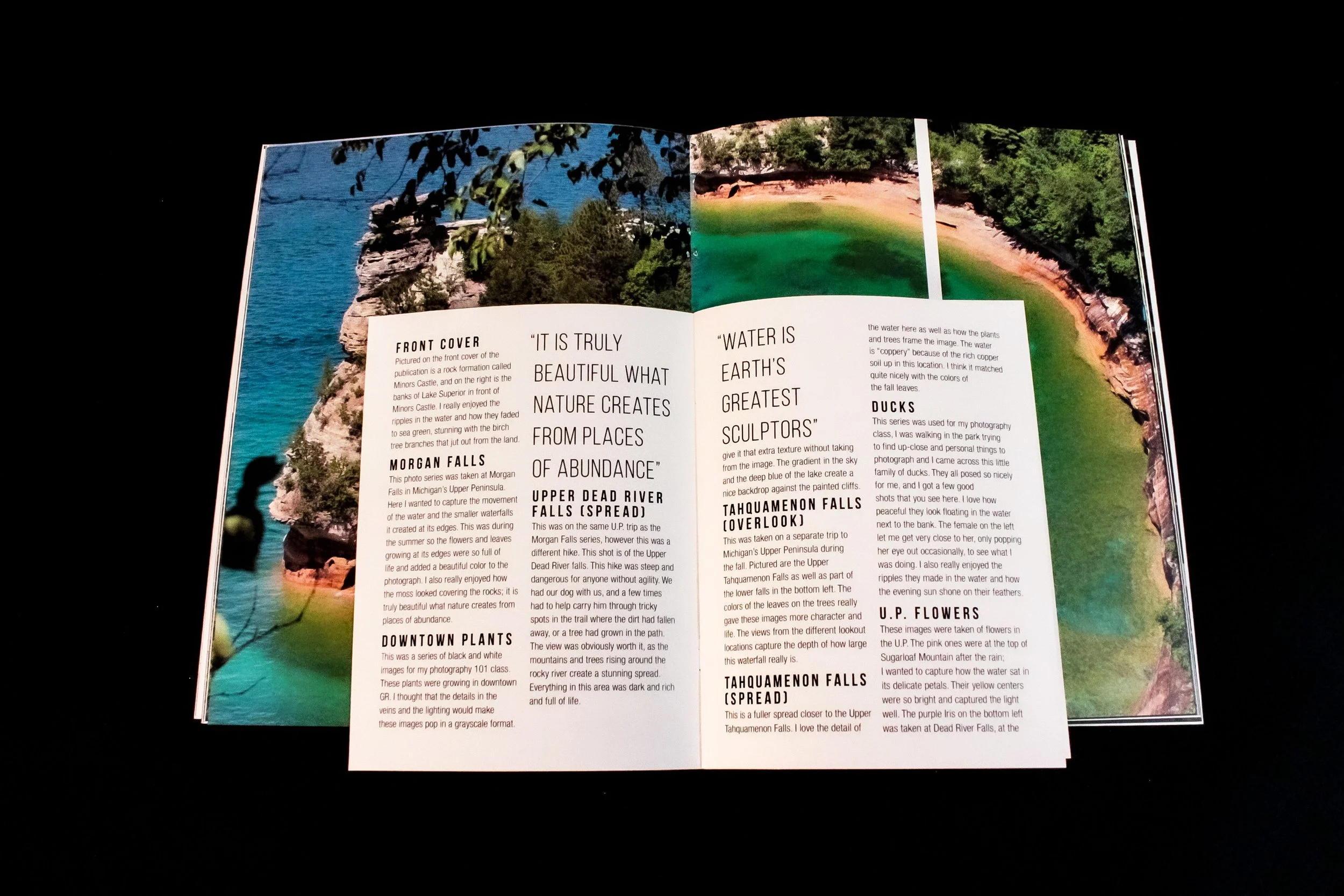
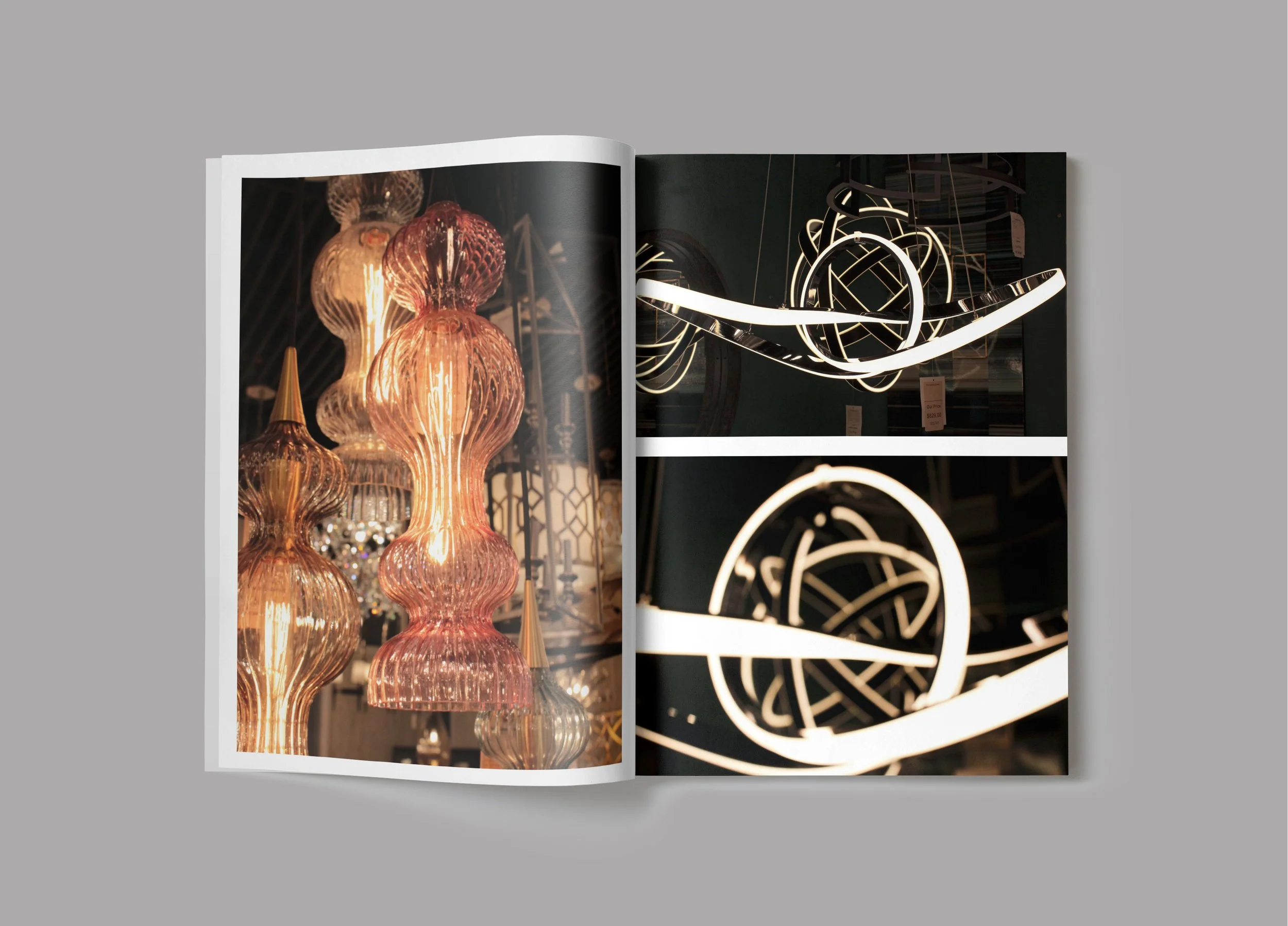
This publication is a series of photographs taken by me, and it presents them in professional layouts of full spreads and margin filled spaces. The choice to make some spreads look more cut and paste using the art of negative space makes it more dynamic and worth looking at. The small booklet in the back of the publication was created to give an explanation to each photograph of where they were taken and why. It is located in the back of the publication to ensure that the viewer can digest the beauty and intensity of the photographs before learning why I took them. My goal was for the viewer to get my perspective as I took each photograph and truly experience the photos in new and interesting ways. The viewer can stand where I stood and get the same inspiration I felt from nature and the things around me.